Redesigning Tropical Smoothie’s Mobile iOS App

TROPICAL SMOOTHIE CAFE
Overview
Tropical Smoothie Cafe is a restaurant franchise in the US with over 800 locations nationwide. Most recently, the brand implemented hyper-local marketing initiatives and enhanced order modes to include curbside and delivery options. Backed by detailed research, this is a concept redesign of the Tropical Smoothie mobile application of the curbside pickup mode. The project spotlights various UX processes including evaluation, user testing, card sorting, and usability testing to improve the checkout flow, design and usability issues solutions.
Details
Role: Lead UX Designer / Researcher
Methods: User Research, App Design, Visual Design, Prototyping, Usability Testing
Tools: Sketch, InVision, Photoshop
Timeline: 2 months
Problem
In response to COVID-19, Tropical Smoothie introduced a curbside pickup option to consumers in their mobile app. While the new offering allows customers to fulfill orders while abiding by social distancing measures, many users struggled with the flow of the process on the mobile app. Over the span of two weeks, I met with users to better understand and re-imagine the digital ordering experience when using the Tropical Smoothie app.
The high level goals were to:
1. Address the usability issues on current app and make necessary improvements
2. Facilitate a better user experience for Tropical Smoothie by improving its UI and design a hi-fidelity prototype
3. Test the prototype with real users, reiterate on the prototype from user feedback
Audi
To help guide my research, I conducted an app audit where I interviewed a diverse network of family and friends. Users were tasked with ordering a smoothie from the current app, utilizing the curbside pickup option while sharing their feedback in real time. Over the course of two weeks, I conducted usability testing on six participants and documented their interactions with the app.
Findings
Users were tasked with placing a mobile curbside pickup order for a smoothie. Through usability testing, I discovered that many users struggled with navigating the menu item to find the desired item which caused frustration and confusion when placing an order. I used these research findings to inform design solution and validated them further with additional usability tests.

User Insights
After conducting six in-person interviews, I gathered and distilled my research into three major pain points:
Individuals preferred the option to check out as a guest (especially if they are in a hurry or do not want to create an account).
Users struggled to successfully locate the menu items as the current app presented 15 menu categories for them to select from.
Individuals felt overwhelmed by item customization screen and shared confusion when focusing on necessary steps to complete their order.
Mental Models
The current mobile menu offers an overwhelming amount of selections that include 15 menu category options. To simply this process, we conducted open and closed card sorting to test the efficacy of both for users.
The results from both card exercises revealed uncertainty as there were too many categories in the menu to choose from. In findings from the closed card sorting, many users placed the subcategories into six main categories. This action suggested that many of the current menu categories were unnecessary. From the open card sorting, users deemed several categories as outliers and from the options, created an average of six categories (smoothies, sandwiches, flatbreads, bowls, kids menu, sides & cookies).

Persona
From these observations, I created a persona that represented a hypothesized individual, Leigha, who frequently uses food pickup services.

Goals
Quick and simple option to check out as a guest.
App that allows her to place an order in advance.
Pain Points
Waiting in long lines when she only wants to order a smoothie.
Having to create an account to order takeout.
User Flow
We decided to draft up the user flow to visualize path of user when completing task of creating an account, placing an order utilizing the curbside pickup option. By sketching this out, we were able to visualize the pain points users experienced with the complex process of carrying out a curbside pickup up order. This mapping strategy allowed me to accurately discover and define individual desires and expectations of the customer journey.

Reframing the challenge
I then moved into redefining the project focus and polishing the vision statement. After synthesizing the collective data and research, I created a design statement to direct the work through the design process.

Mid-fidelity drafts
With a solid understanding of our research insights and pain points our users were experiencing, it was time to translate our insights into design features for improvement on the app for each of the screens.

Visual aesthetics
To keep in line with the core Tropical Smoothie brand identity, I drafted a mood-board that was representative of the brand’s current colors. Taking inspiration from those elements, I kept with a similar theme and selected fresher colors for the redesign.

Redesign
Experience #1: Home Page
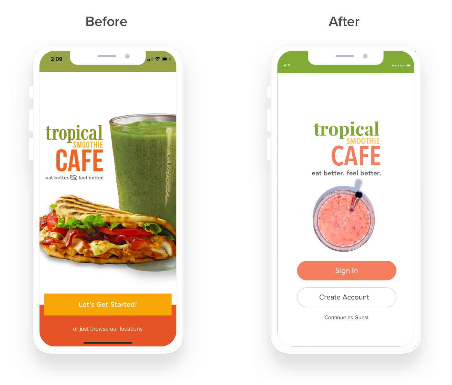
Currently, the app offers users the options to select “Get Started” or “Browse Locations” on the homepage. After performing usability testing, I discovered that users had to either have an account or create one in order to place an order which proved to be a frustration point for some users. Additionally, by selecting “Browse Locations,” users were lead to a dead end. In the redesign, I updated the copy to be more clear with options to ‘Sign In,” “Create Account,” with an additional option to continue as a guest (which many users expressed interest in having). Additionally, I did a brand refresh with a new, updated logo and consistent colors throughout the experience.
Experience #2: Menu Page
Finding the menu categories was a major pain point for users during the usability testing. Many expressed that they want a simple menu and felt that the orange with white text menu was nearly impossible to read and navigate. After performing open and closed card sorting, we discovered that users placed a majority of the menu items under six main menu categories versus the 15 that are currently on the mobile app. To increase the menu’s discoverability, I changed the design to an expanded menu that listed all categories at a glance which meets best practices for accessibility.

Experience #3: Locations Page
In usability testing, I discovered that many users were frustrated on how to navigate back to the previous screen if they needed to change the location. In the redesign, I updated the screen to include a location text box where users could enter their city, state, zip to find the nearest location and then select whether they would like to place a Curbside or Pickup order.

Experience #4: Curbside Pickup
Many users were confused about the flow of the curbside pickup option. In the current mobile app, after selecting the “Curbside Pickup” option, users were prompted to enter the vehicle details and were uncertain on what to do next to continue, “ Do I add my vehicle to the order?” In the revised design, I took this feedback into consideration by moving the vehicle details to the review order section after they entered their order which I felt was a more natural flow to the ordering process. Additionally, I changed the CTA from “Add to Order” to “Checkout” so that it is more clear and straightforward to the user.

Conclusion
Through user research, I was able to gain insight into the goals of food mobile app users. To validate the changes I made, I tested the redesign with surveyed users with my prototype. I asked the same questions from my initial interviews and recorded behaviors and insights.
Learnings
3/3 participants used the “checkout as a guest” option
2/3 users were able to successfully locate menu item under correct category
3/3 participants found the curbside pickup option to be “relatively straightforward.”
Next Steps
Develop menus, lists, past orders
Stylize location pins to distinguish categories
Add social media login options